Lexi Green
Content, Copy & Creative

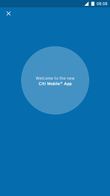


In 2016, the Citi Mobile app was tired. It was clunky. It was … really, really hard to use. In fact, according to McKinsey, 40 percent of the app’s users said that they thought it was difficult to find what they needed on the app.
Along with a team of designers, many product owners, lots of lawyers, and a fleet of engineers, we set out to make the Citi Mobile app much more user-friendly. Over the next six months we crisscrossed the country, hosting co-creation sessions, learning what users needed the most from their banking app, and what they could do without.
I led the overhaul of Citi’s digital copy style guide from the ground up. We made the bank's digital voice more human, cutting down on the legal jargon, streamlining the CTAs, and implementing ADA copy. These new guidelines were implemented throughout all of Citi’s retail banking platforms.